
Black Gray Tattoo vs Color: Which Fits You?
- Chris Young
- 4 days ago
- 6 min read

You can love a design and still choose the wrong palette for it. That is why black gray tattoo vs color is not just a style debate - it is a decision that affects mood, visibility, aging, and how your piece reads from across the room and up close.
Some tattoos hit hardest in pure contrast. Others need color to feel alive. If you are planning your first piece or adding to an existing collection, the best choice usually comes down to your concept, your skin tone, your long-term expectations, and the artist you trust to bring it to life.
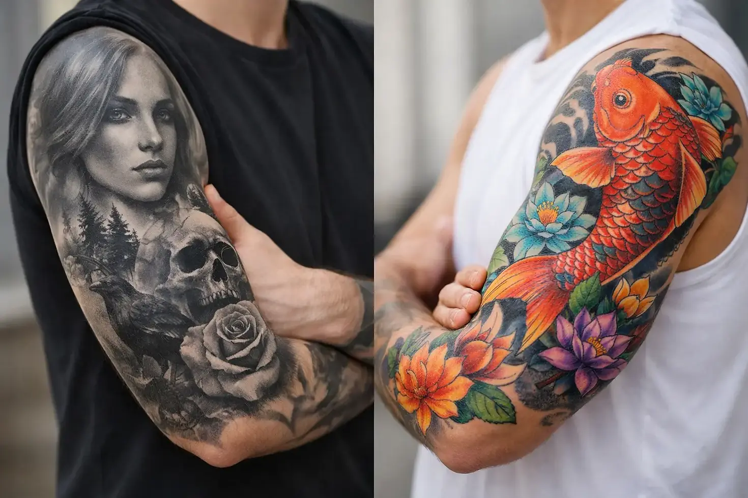
Black gray tattoo vs color: the real difference
Black and gray tattoos rely on linework, contrast, shading, and negative space. They create depth without depending on bright pigments, which gives them a classic, dimensional look. Portraits, religious imagery, realism, Chicano work, fine line concepts, and darker illustrative pieces often thrive in black and gray because the focus stays on form and detail.
Color tattoos use those same fundamentals, but hue becomes part of the design language. Color can create energy, emotion, symbolism, and stronger visual separation between elements. Japanese work, neo-traditional designs, floral pieces, animated concepts, and many custom illustrative tattoos can gain a lot from a well-planned color palette.
Neither is automatically better. The stronger option is the one that fits the design instead of fighting it.
When black and gray makes more sense
Black and gray tends to appeal to people who want something timeless, dramatic, or easier to blend into a broader tattoo collection. It often feels more understated than color, even when the design itself is large or intense. If you want a sleeve or back piece that ages with a classic look, black and gray is a strong direction.
It also works especially well for pieces built around texture, shadow, or realism. Think smoke, stone, fabric folds, animal fur, faces, skulls, religious figures, or memorial tattoos. These concepts often gain emotional weight when the artist can focus on light and dark without managing multiple hues.
For many clients, black and gray also feels easier to wear every day. It can look bold without being loud. That matters if you want visible tattoos that still read as refined.
When color is the better choice
Color makes the most impact when the design depends on vibrancy, symbolism, or visual contrast between different elements. A rose and snake composition, a Japanese dragon, a bright illustrative piece, or a nature-inspired tattoo can all feel more complete in color.
Certain themes lose part of their personality without it. Fire, gemstones, botanicals, stained glass effects, cartoon-inspired work, and many traditional tattoos often benefit from carefully chosen color because hue is doing part of the storytelling.
Color can also help a tattoo stand out faster from a distance. A strong red, rich blue, or warm gold can pull the eye in immediately. If your goal is a statement piece, color gives your artist another tool to create that impact.
How each style ages
This is one of the biggest questions clients ask, and the honest answer is that all tattoos change over time. Skin changes. Sun exposure matters. Placement matters. Aftercare matters. Artist technique matters a lot.
That said, black and gray often ages more predictably. As the tattoo settles and softens over the years, it can still hold a strong look because the design is built around contrast and shading rather than brightness. A well-executed black and gray piece can mature beautifully.
Color tattoos can age just as well when they are applied properly, but some pigments may soften or lose intensity faster than black ink. That does not mean color ages badly. It means it may need more thought around saturation, sun protection, and possible touch-ups down the road.
If you spend a lot of time outdoors, this part matters. UV exposure is rough on tattoos across the board, but it tends to be especially noticeable in brighter colors.
Skin tone and tattoo choice
A good artist does not force every design into the same formula. Skin tone changes how both black and gray and color will read once healed, so the right choice should be made with real skin in mind, not a filtered reference photo.
Black and gray can create strong, elegant results across a wide range of skin tones, especially when the artist understands contrast and leaves enough breathing room in the design. On deeper skin tones, this can mean adjusting values so the tattoo stays readable instead of becoming muddy over time.
Color also works on a wide range of skin tones, but not every shade performs the same way on every client. Some colors pop more than others depending on undertone and depth of complexion. An experienced tattooer will choose pigments and contrast levels that suit your skin rather than chasing a copy-paste palette from the internet.
That is one reason custom consultation matters. The best tattoo is not built in theory. It is built for your body.
Pain, session time, and healing
Clients often ask whether black and gray hurts less than color. In practice, pain depends more on placement, your tolerance, session length, and how heavily the area is worked. A color tattoo may involve more packing and layering in certain sections, which can make some parts feel more intense. But a highly detailed black and gray realism piece can be a long, demanding session too.
Healing can also vary by approach. Dense color saturation sometimes leaves an area feeling more worked than softer gray shading, but there is no universal rule that one heals easy and the other heals hard. Technique matters. So does aftercare.
If your schedule, pain tolerance, or budget means you need to break a project into manageable sessions, that is worth discussing early. The right plan can shape whether black and gray or color makes more sense for your piece.
Style compatibility matters more than trends
A lot of people frame black gray tattoo vs color as a personal preference question, but it is really a design question first. The subject matter should lead.
A black and gray lion portrait can feel powerful because the realism and texture do the heavy lifting. A traditional eagle may feel flat without the bold reds, yellows, and blues that give the style its punch. A floral piece could work beautifully either way, depending on whether you want soft botanical elegance or a brighter, high-contrast statement.
Trends come and go. Your tattoo stays. If you are choosing color because it is getting attention online, or choosing black and gray because it feels safer, pause for a minute. Ask what actually matches the idea you want on your skin five years from now.
Your existing tattoos should influence the decision
If you already have tattoos, your new piece should not be chosen in isolation. A fresh tattoo becomes part of a larger visual story.
If your collection is mostly black and gray, adding one color piece can either create a standout focal point or feel disconnected. Sometimes that contrast is exactly the right move. Sometimes it throws off the flow. The same goes in reverse if you already have a color-heavy arm or leg.
This is where a portfolio-minded studio approach helps. Placement, surrounding work, and future plans all shape the smartest choice.
The artist matters as much as the palette
A mediocre black and gray tattoo is not better than a great color tattoo, and the reverse is true too. Execution decides everything. Smooth shading, smart contrast, clean linework, color theory, saturation, and composition all matter more than broad internet opinions about which style is best.
Look at healed work. Look at how that artist handles the kind of subject you want. A specialist in black and gray realism may be the perfect fit for your memorial piece, while a different artist may be the better choice for a full-color illustrative design.
At a custom studio like Skinwalker Studio, that artist match is part of the process. The point is not to push every client toward one lane. The point is to create something truly special that fits the person, the concept, and the craft.
So which should you choose?
Choose black and gray if you want timeless contrast, subtle wearability, or a design driven by realism, mood, and shadow. Choose color if your concept needs vibrancy, symbolism, or visual energy that black and gray cannot fully deliver.
And if the answer is both, that is valid too. Some of the strongest custom tattoos use black and gray as the foundation, then bring in selective color for emphasis. Done right, that approach can create a piece with depth, focus, and serious personality.
The best tattoos are not picked from a simple style argument. They are built around what you want the piece to say every time you look at it. Start there, and the right palette gets a whole lot clearer.


Comments